Ecological Artifacts of Zoning Policy Change
Brooklyn, New York City — 2000 to 2025
Running total of NYC DOB new-building permit filings (2000–2025), geocoded and spatially joined to study area boundaries, with vertical markers at key rezoning events.
When cities rezone manufacturing districts as residential, the new developments inherit and perpetuate spatial logics designed for industry — superblocks, wide arterials, sparse intersections, minimal vegetation, and distance from transit. These "ecological artifacts" of prior zoning persist in the urban fabric long after the factories are demolished, creating neighborhoods that look residential but function like industrial zones for the people who live in them.
The result: transit-poor, car-dependent, heat-vulnerable, amenity-starved enclaves that accelerate gentrification and displace the very urbanism they claim to join.
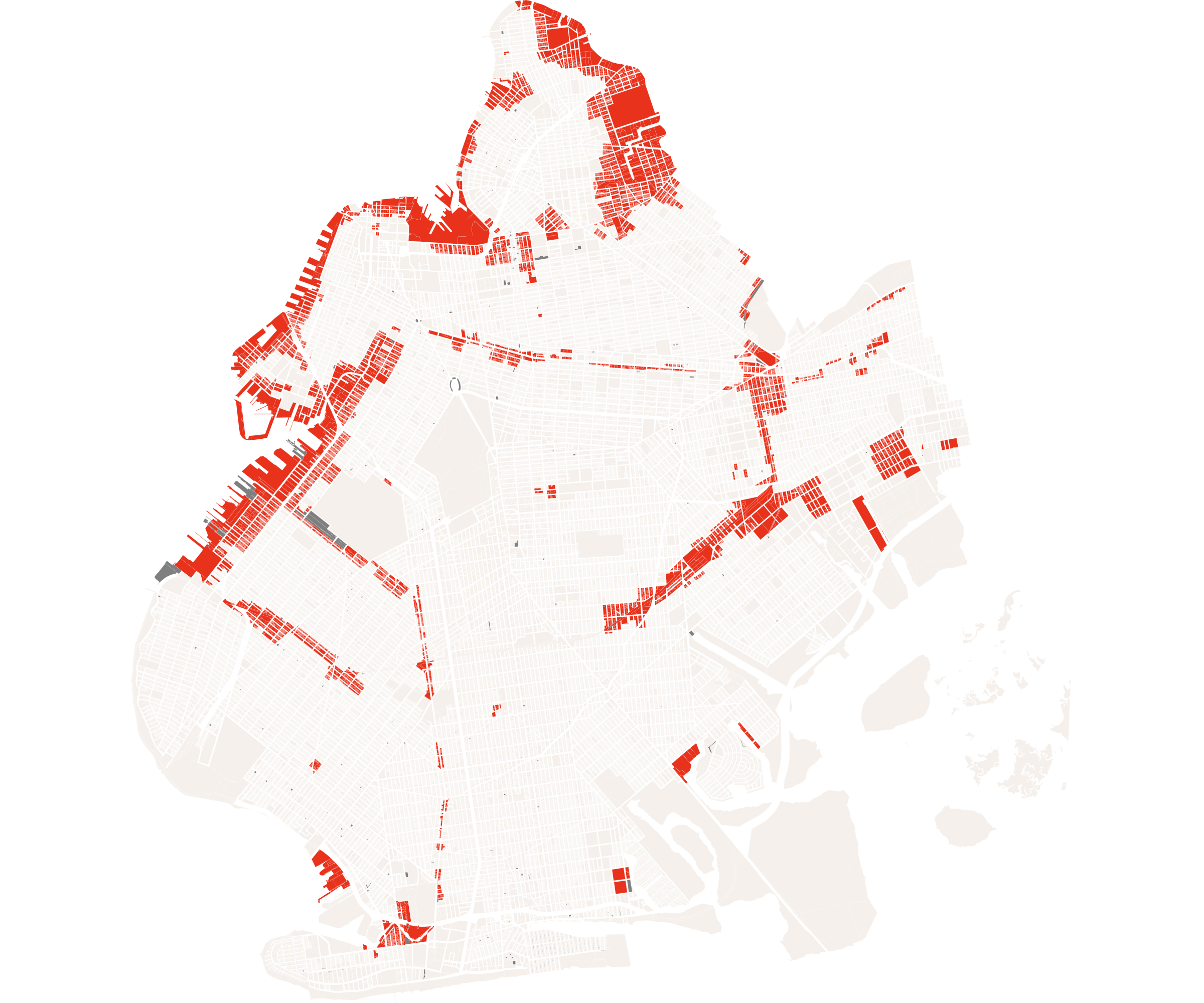
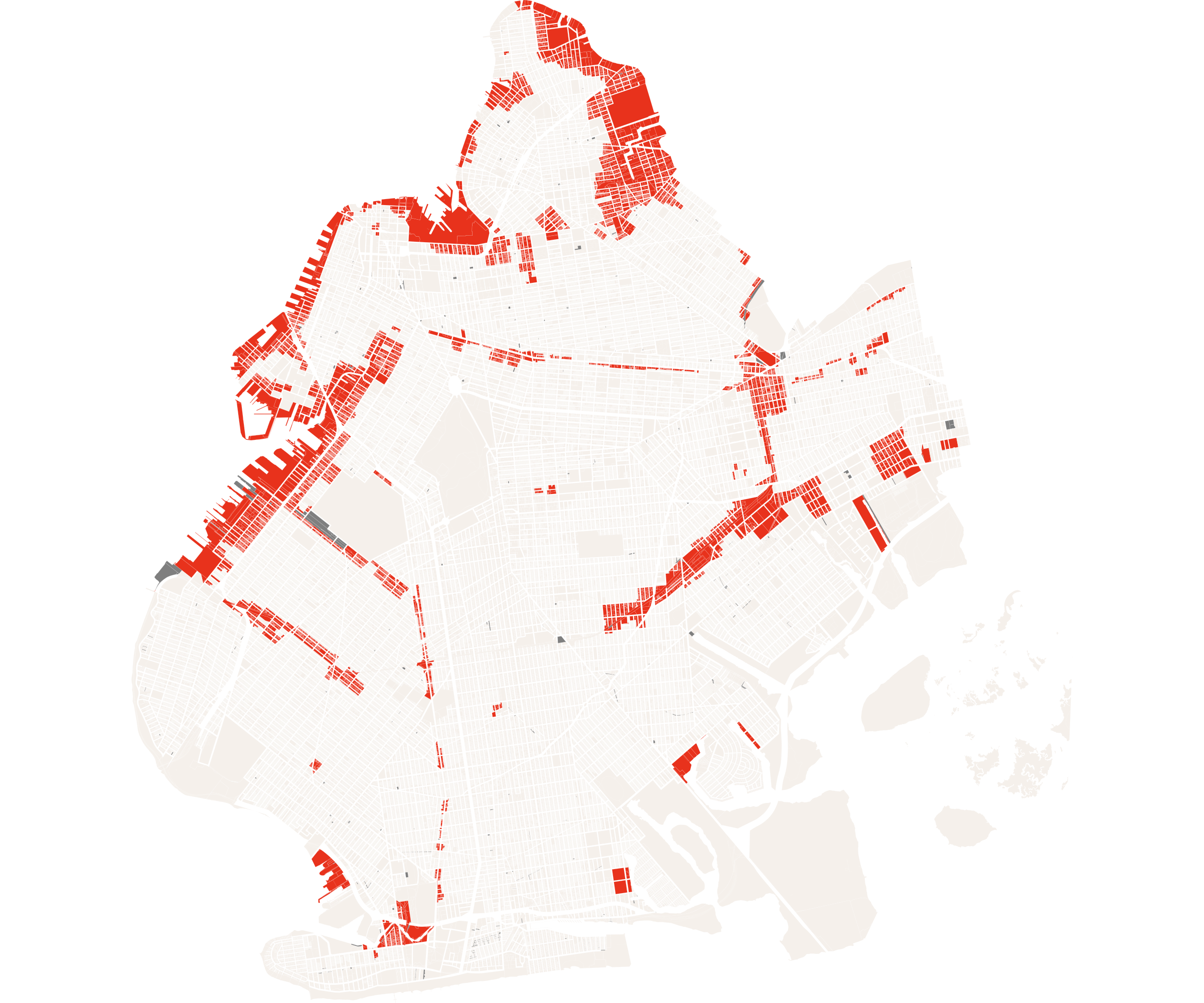
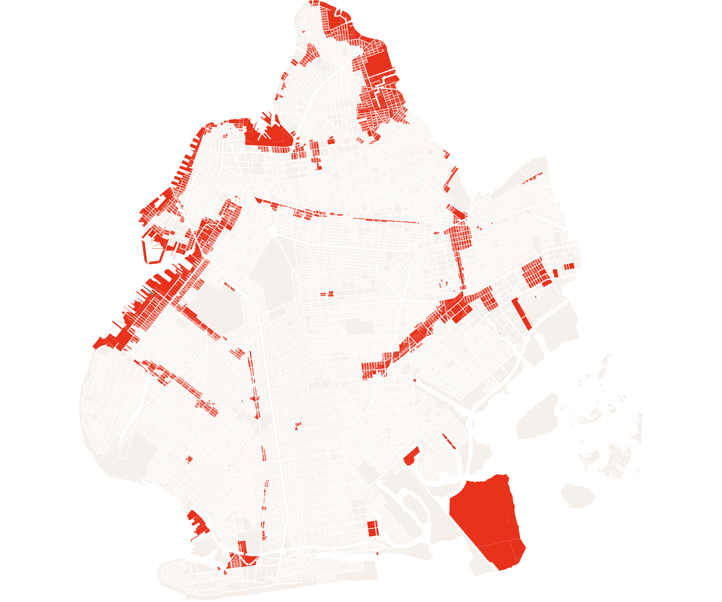
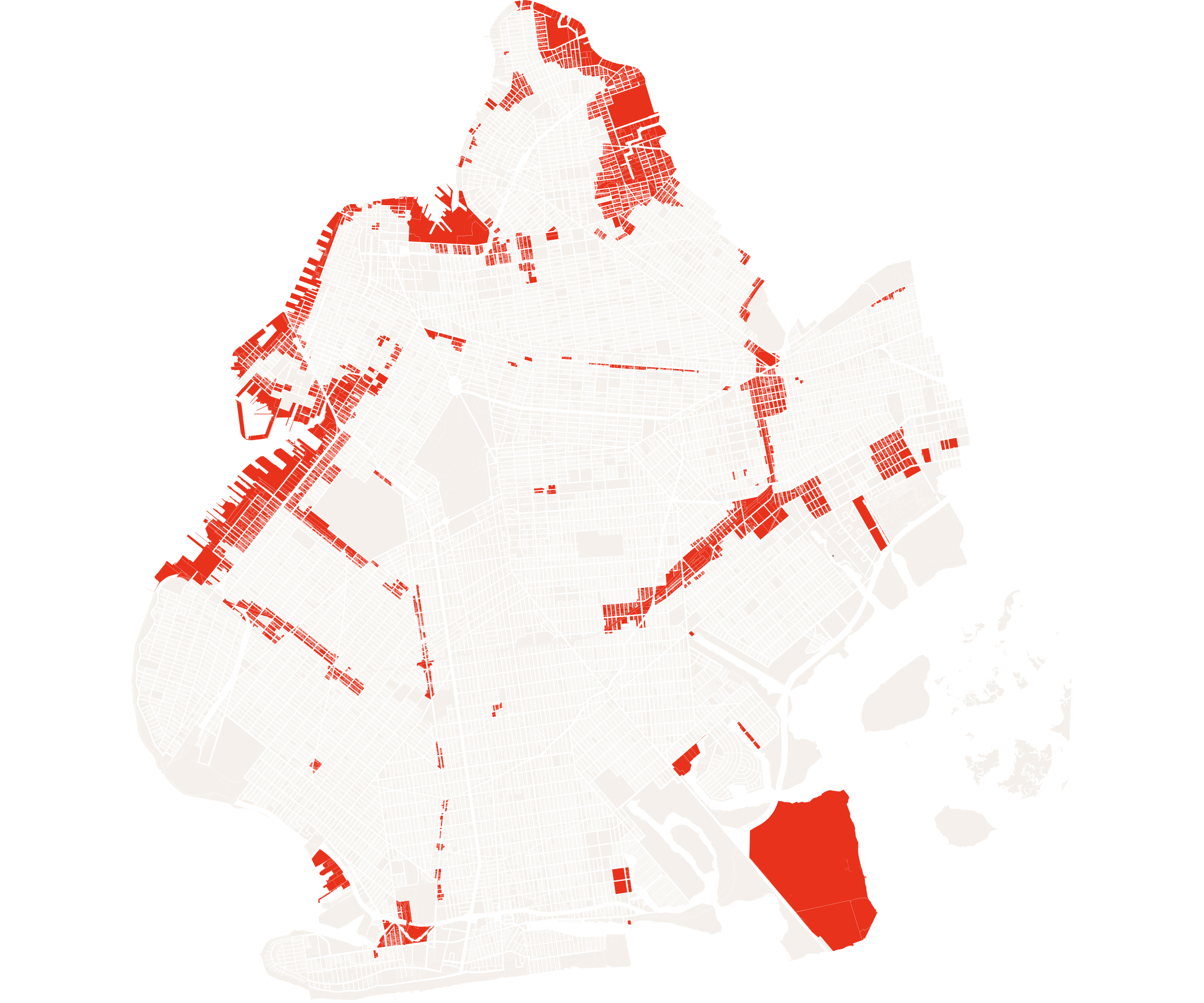
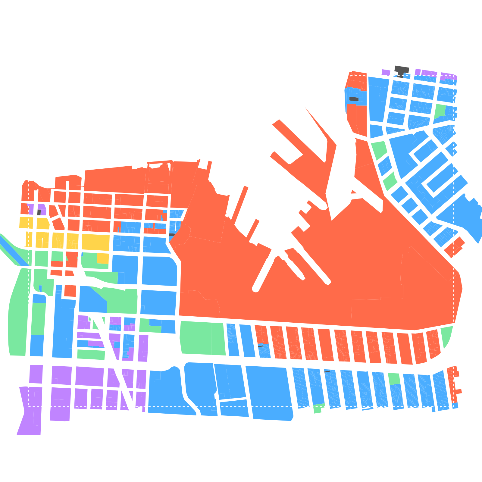
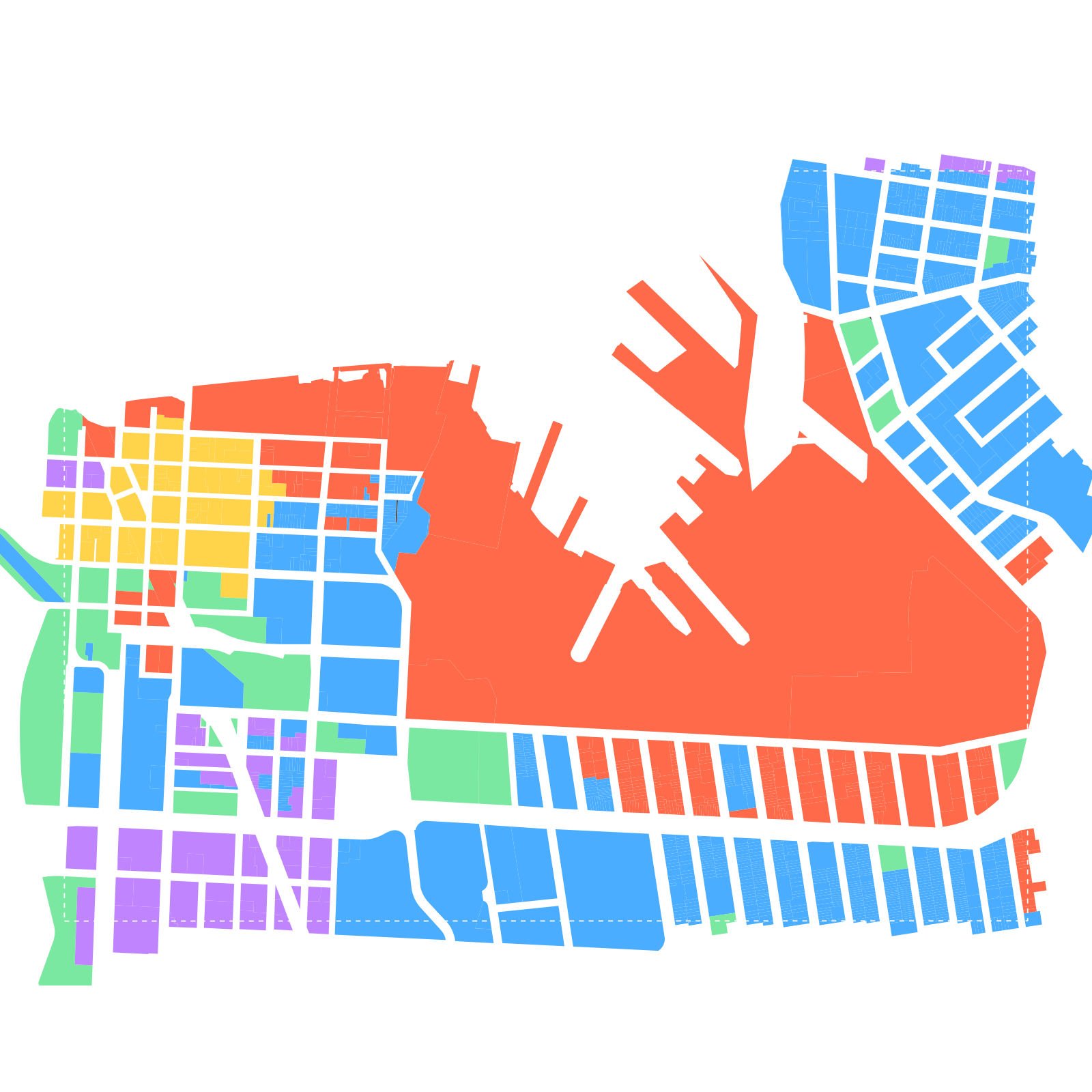
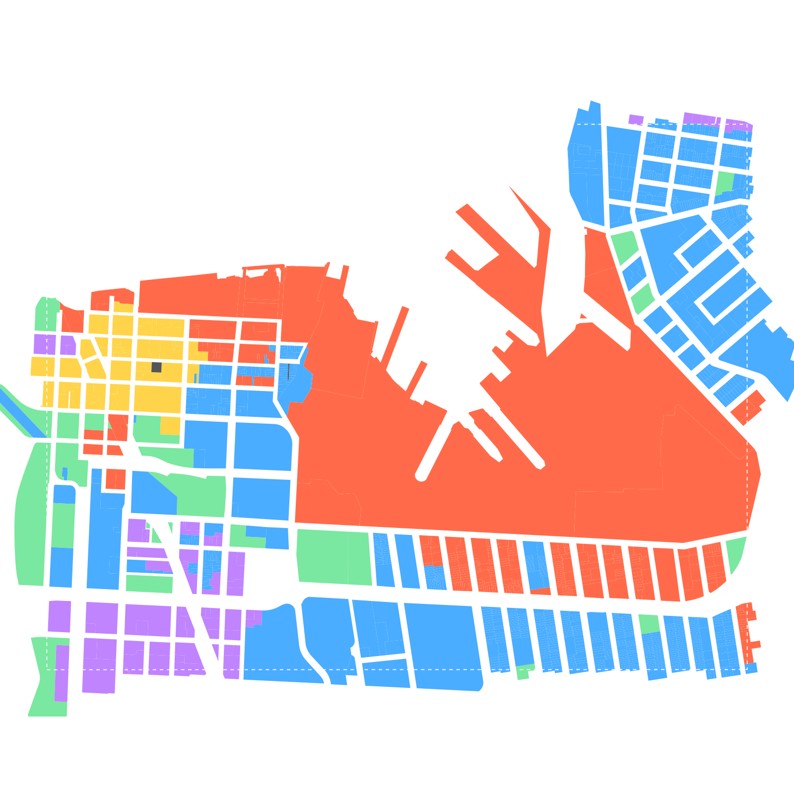
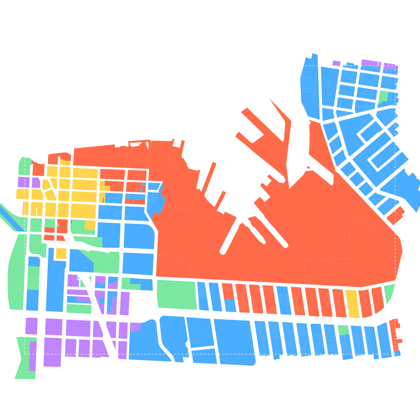
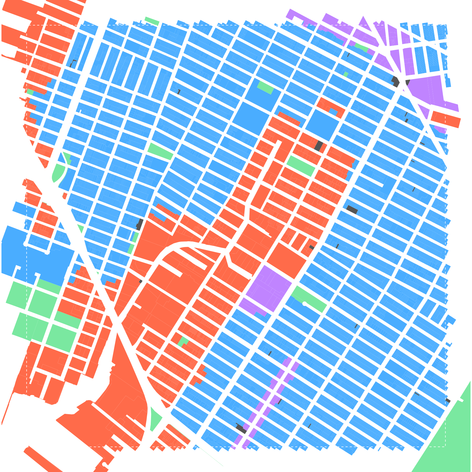
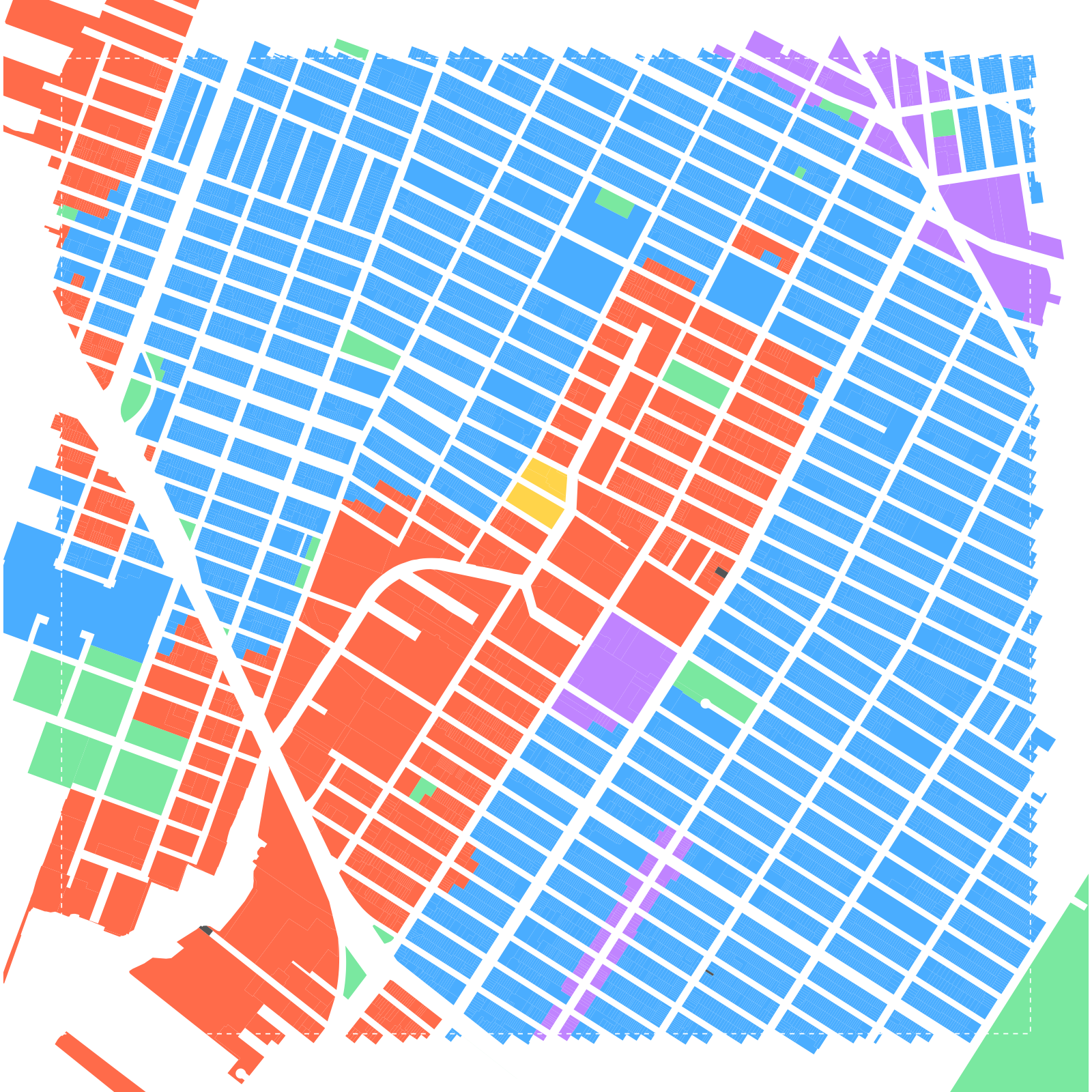
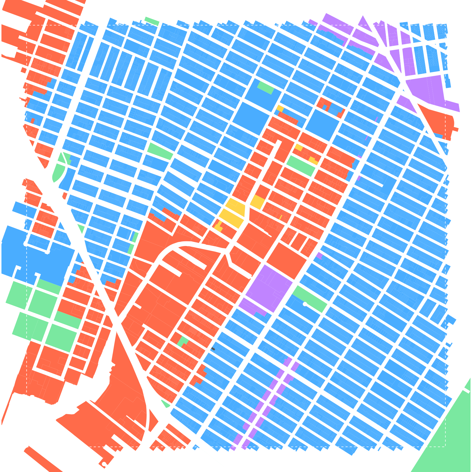
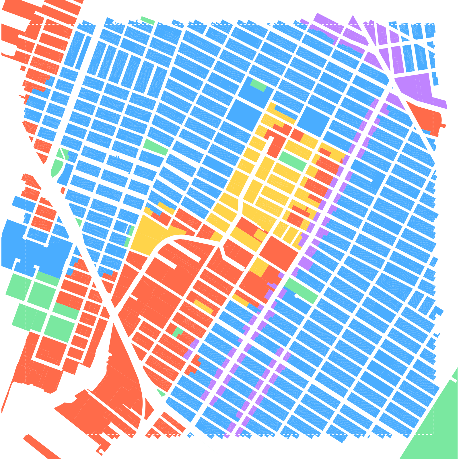
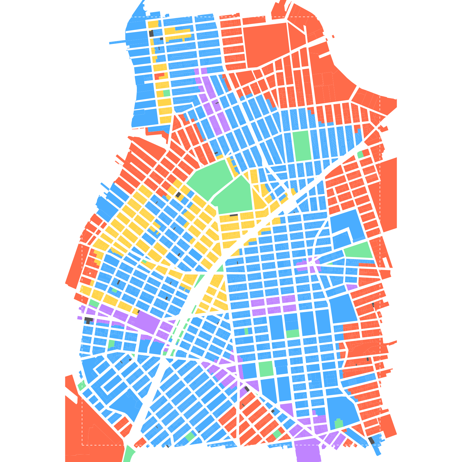
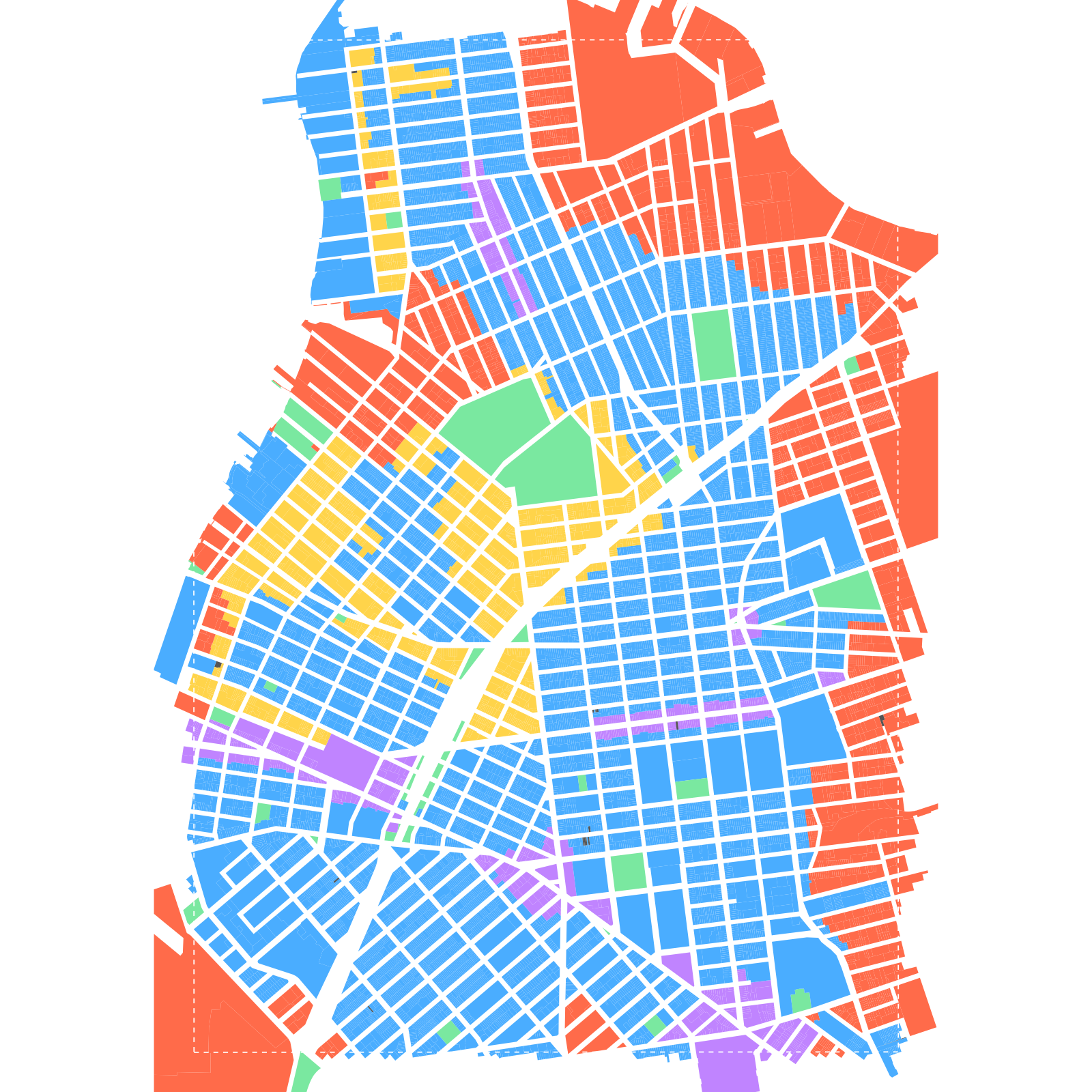
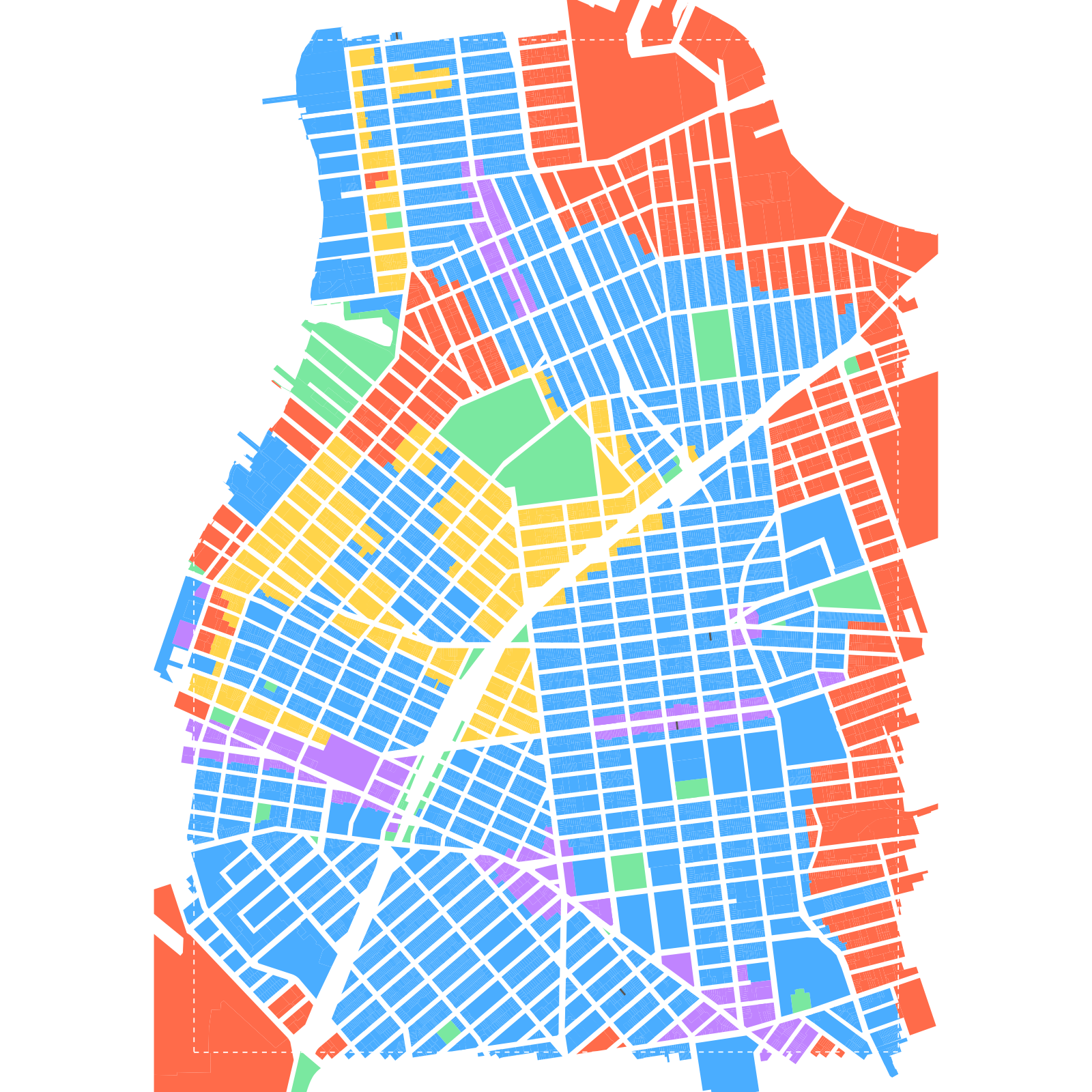
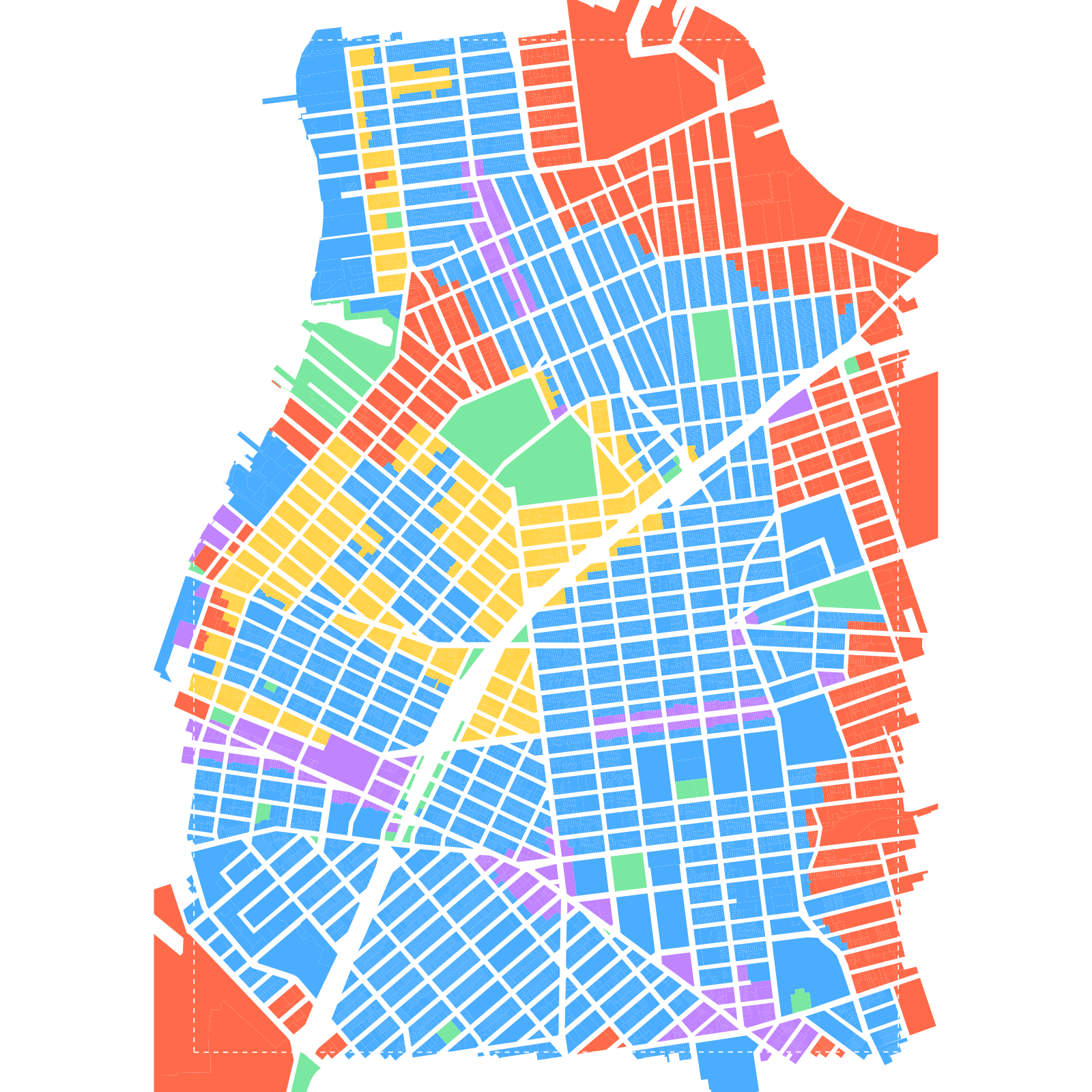
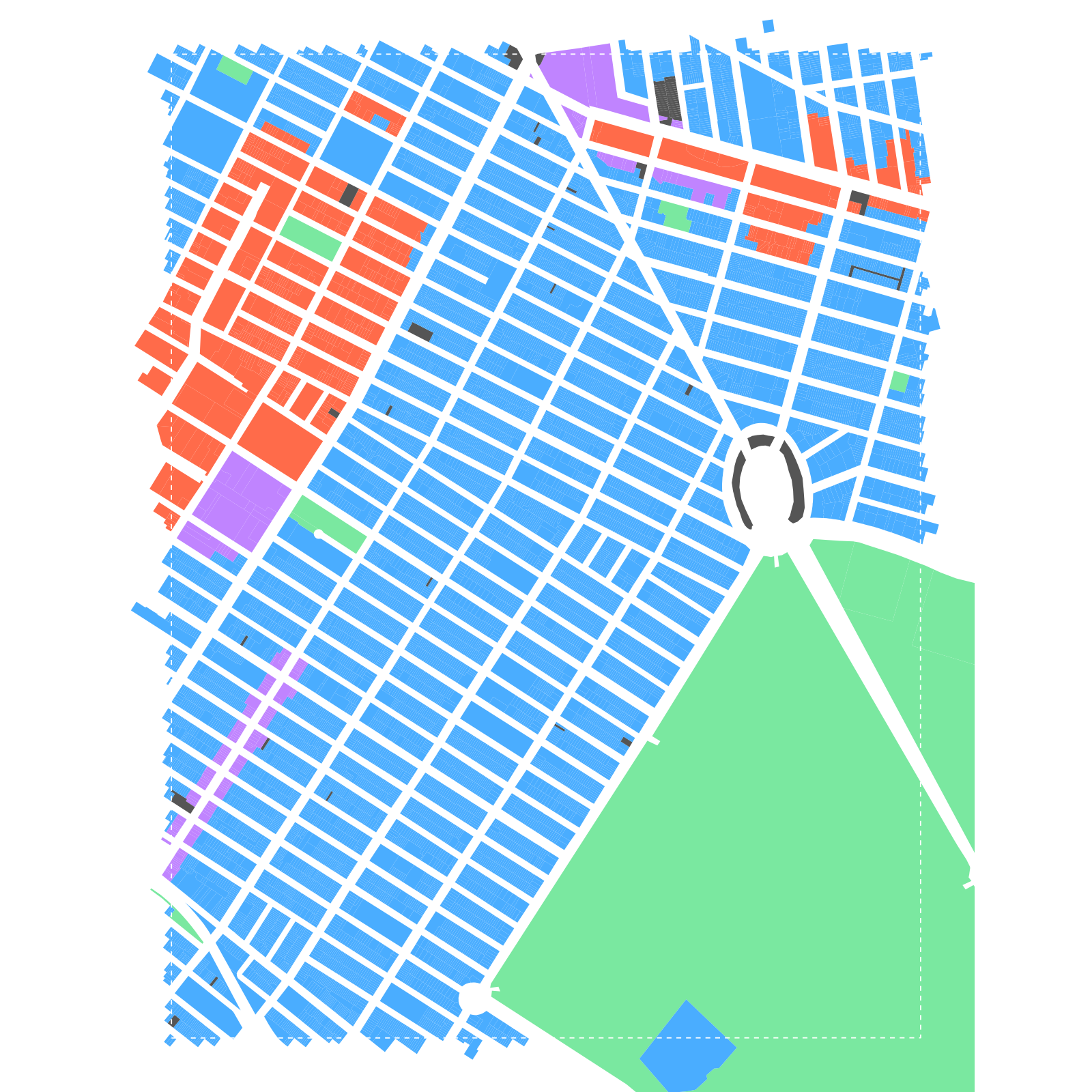
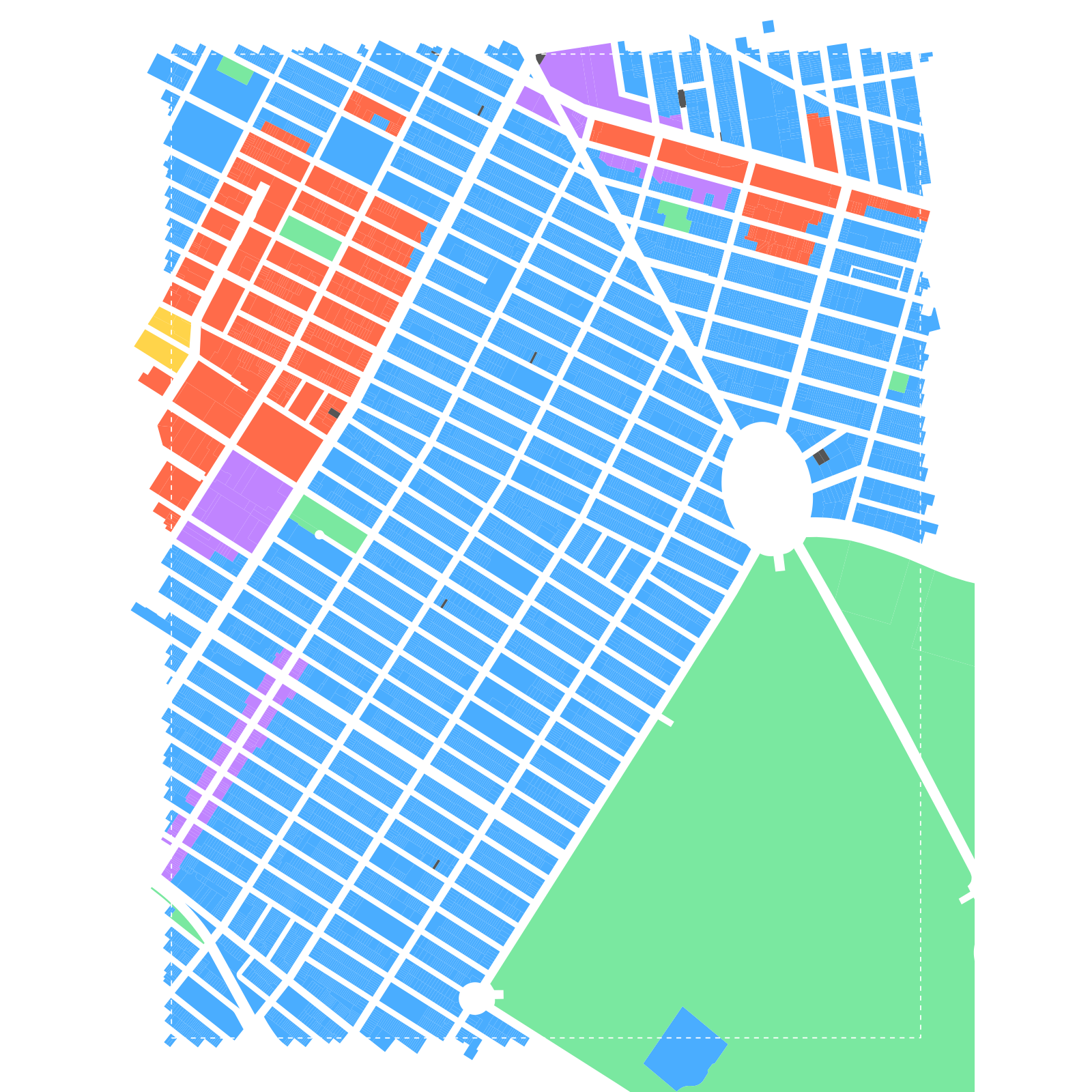
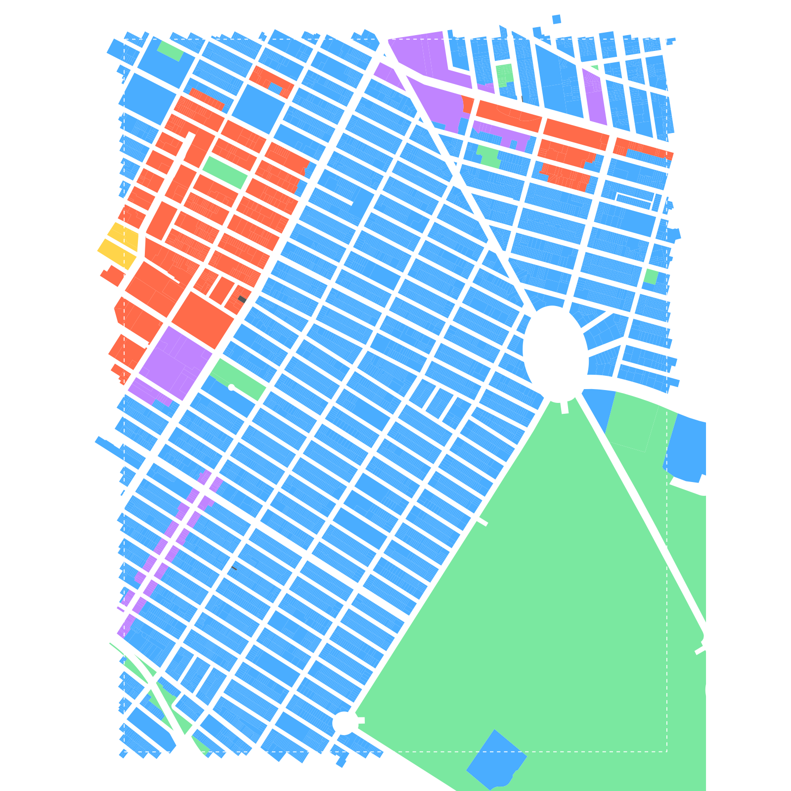
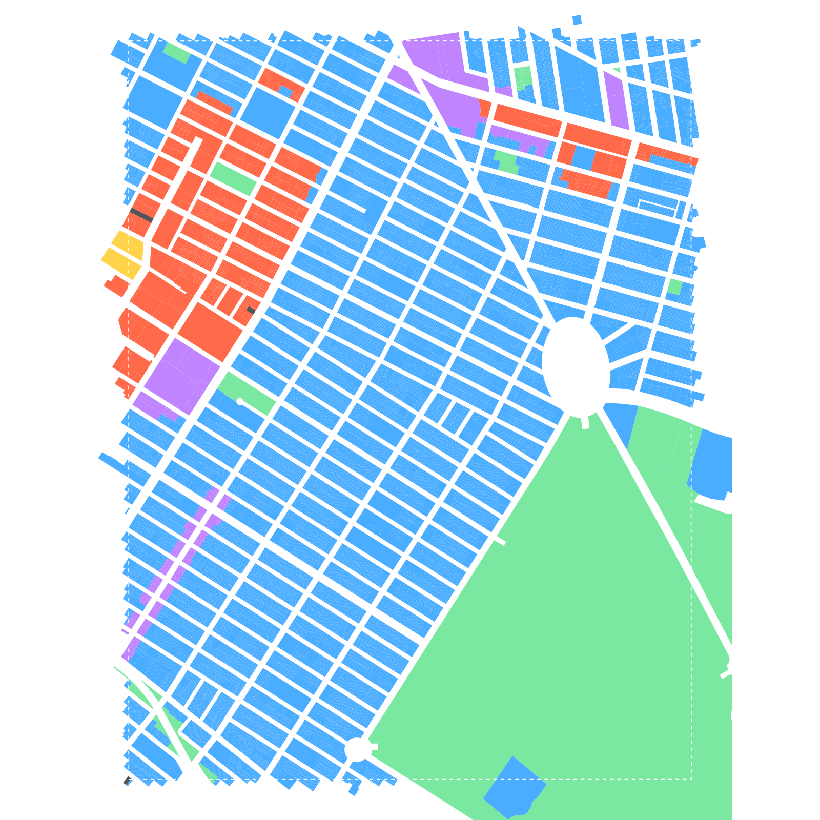
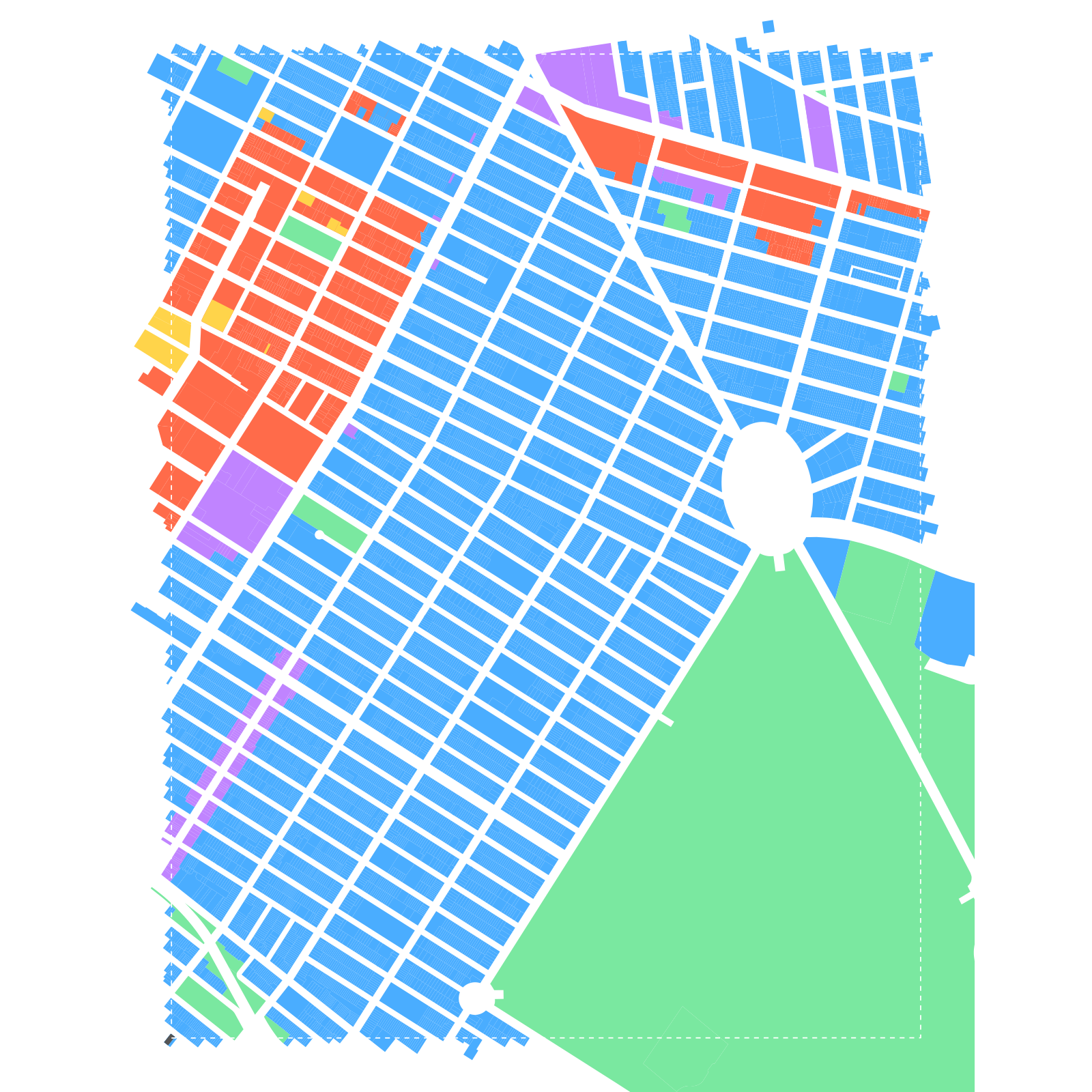
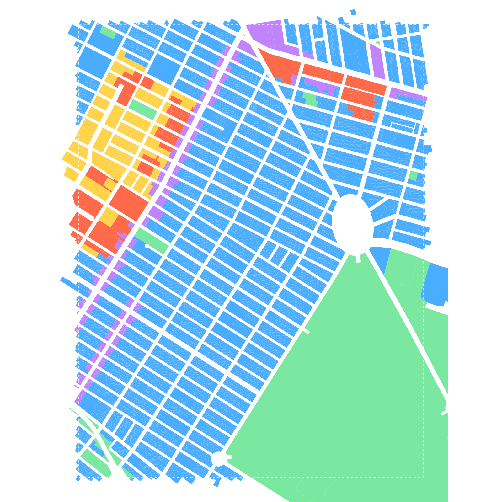
Thematic maps from NYC DCP zoning district shapefiles (1961 base and 2025 current), with each lot classified by zone code into six land-use categories to show the conversion of waterfront manufacturing zones.
zoning typologies
Manufacturing districts are located near arterial streets optimized for freight movement, not pedestrian circulation. When converted to residential use, these street networks — designed for truck access, loading docks, and industrial-scale block dimensions — persist as the underlying grid. The sudden introduction of residential density onto this infrastructure creates transit deserts: developments too distant from subway stations to function without personal vehicles, generating bottleneck effects that propagate through adjacent street networks.
These developments typically lack access to existing neighborhood amenities. When anchor tenants — a grocery chain, a pharmacy — are co-built with the development, they displace demand from established local businesses, accelerating the gentrification cycle that rezoning was nominally designed to counteract.
The morphological inheritance is measurable: intersection density, average block perimeter, impervious surface coverage, and tree canopy ratio all retain signatures of their manufacturing-era predecessors, even as the land use classification shifts from M to R on the zoning map.


Even after demolition and subdivision, converted manufacturing blocks preserve the perceived scale of their industrial predecessors. Building footprint analysis reveals that converted zones contain buildings 2-4x larger in footprint area than their residential neighbors. In DUMBO, the average converted-zone footprint is 10,009 sqft — nearly four times the residential average of 2,536 sqft. 31.2% of DUMBO's converted buildings exceed 10,000 sqft, compared to just 4.4% of residential buildings.
The entire cumulative distribution is shifted rightward: converted zones retain a heavier right tail of large-format buildings that simply do not exist in the residential fabric. Lot coverage — the ratio of footprint area to lot area — confirms the industrial legacy: factories maximized floor-to-lot coverage with minimal setbacks, and this spatial logic persists in the parcels that replaced them.
Building footprints from the NYC Building Footprints dataset (1.08M records), spatially joined to PLUTO zoning transitions and classified into four area-based size classes.
Reversed cumulative distribution (exceedance curve) on a log-scale axis comparing the proportion of buildings exceeding each footprint-area threshold between converted and residential zones.
Five footprint metrics (average size, percent large buildings, lot coverage, floor count, post-2005 share) normalized to the Park Slope Residential baseline and plotted as grouped bars.
The morphological fingerprint synthesizes street connectivity, building massing, and land cover into a single composite profile. Normalized to the Park Slope residential baseline (1.0x), each study site's converted zone is plotted across six dimensions. The radar chart makes the "phantom grid" visible at a glance: every converted zone deviates from the residential ideal in the same direction — lower connectivity, longer segments, larger footprints, more impervious surface, less canopy.
Gowanus shows the most extreme deviation across all dimensions: a 44% longer average street segment, 2.6x larger average footprint, 82.3% impervious surface with only 5.1% tree canopy. It is the clearest example of what this project terms an ecological artifact — a neighborhood whose physical infrastructure retains the logic of its former use, regardless of what the zoning map now says.
Eight morphological metrics (street, footprint, and land cover) normalized to Park Slope Residential = 1.0, synthesized from three sub-zone metric datasets to produce a comparative morphological fingerprint.
analysis
The connectivity index — the ratio of edges to nodes in the local street subgraph — measures how many alternative routes exist between any two points. In every neighborhood, the converted sub-zone scores lower than its residential counterpart. Williamsburg shows a 19.0% deficit; even Park Slope's own small converted pocket registers a 20.1% drop. This is a structural inheritance from industrial street design, which optimized for throughput over redundancy.
| Neighborhood | Converted | Residential | Deficit |
|---|---|---|---|
| Williamsburg | 1.485 | 1.834 | -19.0% |
| DUMBO / Navy Yard | 1.658 | 1.690 | -1.9% |
| Gowanus | 1.708 | 1.785 | -4.3% |
| Park Slope | 1.514 | 1.894 | -20.1% |
Gowanus presents the strongest morphological signature: converted-zone street segments average 130.3 feet versus 90.5 feet in the residential fabric — a 44% increase. The streets that once served the Gowanus Canal industrial belt were laid out in long, unbroken runs oriented toward freight movement, and that geometry persists even as the buildings along them have been rezoned for apartments.
Street network edges extracted from the OSM walking network GraphML, clipped to each study area with PLUTO-classified converted-zone streets highlighted against a dim neighborhood background.
The bar chart normalizes all metrics to the Park Slope residential baseline. Blue bars represent converted zones; green bars represent residential zones. The connectivity index is consistently suppressed for converted zones across all four neighborhoods. DUMBO's anomalous intersection density spike is clearly visible — a reminder that raw count metrics can be misleading without qualitative context, as its 451.7 intersections per km² reflect highway interchange ramps and Navy Yard access roads, not pedestrian intersections.
scoring
Converted manufacturing zones are transit deserts despite their residential density, producing car dependency as a direct consequence of inherited industrial spatial logic. The project computes a composite accessibility index comparing route efficiency from converted sites against the Park Slope control, using MTA GTFS schedule data and network-distance routing.
For a grid of sample points across each study area, compute network walking distance to nearest subway entrance. Up to 5 minutes is acceptable; each additional minute beyond that threshold penalizes the score. Elevation change along the route applies a further gradient penalty derived from USGS DEM data.
Parse MTA GTFS feeds to compute optimal routes from each study site centroid to Midtown Manhattan (Penn Station / Grand Central). Route count, transfer count, and total door-to-door travel time are weighted into the composite score. Bus routes within a 5-minute walk radius that provide meaningful connectivity contribute positively.
Weighted score combining walk-to-subway time, available route count, commute duration, and bus connectivity. Normalized to Park Slope = 1.0. Testable claim: median walk-to-subway time in converted zones exceeds 12 minutes versus less than 7 minutes in the control.
The environmental surface deficit compounds the morphological one. Every converted zone has a higher impervious surface percentage and a lower tree canopy percentage than its residential counterpart. The widest gaps appear in DUMBO (+25.8 percentage points impervious, -24.0 points tree canopy) and Park Slope's converted pocket (+20.1 points impervious, -15.6 points tree canopy).
| Neighborhood | Zone | % Imperv. | % Tree | Perv. Ratio |
|---|---|---|---|---|
| Williamsburg | Converted | 78.4% | 8.8% | 0.209 |
| Residential | 76.8% | 17.6% | 0.231 | |
| DUMBO | Converted | 83.1% | 8.0% | 0.165 |
| Residential | 57.3% | 32.0% | 0.427 | |
| Gowanus | Converted | 82.3% | 5.1% | 0.177 |
| Residential | 69.4% | 21.7% | 0.304 | |
| Park Slope | Converted | 92.8% | 4.8% | 0.072 |
| Residential | 72.7% | 20.4% | 0.273 |
Tree canopy is the single most telling indicator. Residential zones maintain 17-32% canopy — a legacy of street trees, backyards, and institutional setback landscaping embedded in residential zoning codes. Converted zones range from 4.8% to 8.8%. Two decades after rezoning, the canopy has not recovered.
Land cover composition computed by masking the NYC 2021 six-inch raster to PLUTO-classified lot polygons, counting pixel-class frequencies across seven cover types.
construction
The temporal analysis splits each site into layers demarcated by policy implementation and subsequent construction waves. Six MapPLUTO vintages (2005, 2009, 2013, 2017, 2021, 2025) are loaded for Brooklyn, with each lot's zoning classification tracked across all vintages. DOB permit data is spatially joined to study area boundaries to identify new-building permit spikes following each rezoning action.
The three converted study sites experienced over 80% conversion from manufacturing zoning to residential or mixed-use between 2000 and 2025, with permit spikes occurring within 2–4 years of each rezoning action. Core gateway developments — often star-architect designed — establish the precedent that subsequent market-rate towers follow.
- Williamsburg / Greenpoint — Converted. 2005 Greenpoint-Williamsburg rezoning (175 blocks, M1-2 to R6/R8)
- DUMBO / Navy Yard — Converted. Incremental ULURP actions, 2004 onward
- Gowanus / North Sunset Park — Converted. 2021 Gowanus rezoning (82 blocks) + Superfund overlay
- Park Slope — Control. Historic established residential, no manufacturing conversion
2000 — 2025
- MapPLUTO multi-year archive — 2003, 2005, 2009, 2013, 2017, 2021, 2025 vintages
- NYC zoning shapefiles — current districts, 1961 base districts, all amendments
- DOB job applications — new building permits with coordinates
- Brooklyn orthoimagery — 2006 and 2024 aerial tiles
- OSM street network — walk and drive GraphML
- NYC building footprints — 1.08M rows with WKT geometry and height data
- NYC Land Cover rasters — 2017 and 2021, 7-class classification
- Landsat imagery — thermal and multispectral bands
- MTA GTFS feeds — subway and bus schedules, entrance locations
- StreetEasy rental data — median asking rent, price index, inventory
- NYC licensed businesses, 311 complaints, parks, schools, sidewalks
- TLC trip records — rideshare pickup/dropoff density